Natalie G11 & 12 Artist Portfolio '15 - '17
Grade 9 - Abstract Art


White Flowers, Watercolour, 22.8cm x 30cm, January 23 2014
White Flowers One, Watercolour, 22.8cm x 10cm, January 23 2014
White Flowers Two, Watercolour, 22.8cm x 10cm, January 23 2014
White Flowers Three, Watercolour, 22.8cm x 10cm, January 23 2014
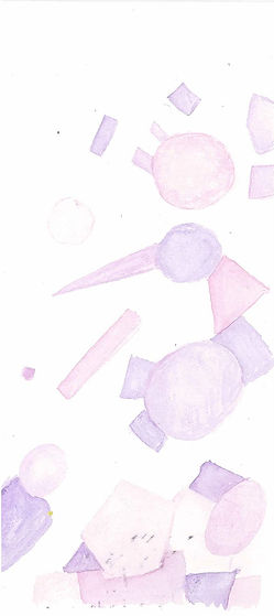
I have permitted this artwork to be seen by a larger audience. These three series of paintings are actually an abstracted flower. It's original colour was a creamy white. I wanted do something different with colors, so I chose the turquoise blue-green for the flower, as I don't think there are many flowers in this colour. The color scheme of these paintings are a triad harmony, which includes red-violet, yellow-orange and blue-green (magenta, marigold and turquoise). This color scheme is quite relaxing in my opinion so this is the color scheme I have chosen to use for this series and my second series as well. Magenta symbolizes harmony, love and happiness. Marigold can symbolize passion and creativity and finally, turquoise can symbolize clarity and balance. I think that these three colors create a balanced and relaxing color palette which I really enjoy using.


Dainty Petals, Watercolour, 45.6cm x 30cm, January 30 2013
Dainty Petals One, Watercolour, 22.8cm x 10cm, January 23 2014
Dainty Petals Two, Watercolour, 22.8cm x 10cm, January 23 2014
Dainty Petals Three, Watercolour, 22.8cm x 10cm, January 23 2014
Dainty Petals Four, Watercolour, 22.8cm x 10cm, January 23 2014
Dainty Petals Five, Watercolour, 22.8cm x 10cm, January 23 2014
I have permitted this artwork to be seen by a larger audience. To continue with my color scheme, I used the same colours which are red-violet, yellow-orange and blue-green. It creates harmony and unity through all of my watercolor paintings. These paintings are abstracted flowers as well. The different sections of petals or leaves make up the different shapes. For this collection, I wanted to experiment with textures and different brushstrokes. It has a contemporary and modern feel even when it is a painting of flowers.
Process Paragraph:
This unit combined two different art categories, abstract art and watercolour. I have always loved watercolour as I love the effect that you can create with it. As we were taking inspiration from photographs that we have taken, that aren't people, the only ones I really have were flowers, so that was the main topic of my paintings. This unit wasn't too difficult and I had a lot of fun abstracting the images. You could see the process of a plain copy, to abstracting on different levels. I could see my skills developing through the different paintings I have done. In the beginning, they were streaking and the colors were really strong, but towards the end, they became smooth and more transparent which is how I like them. I have learnt a lot of techniques throughout this unit, mainly the types of brush strokes like stippling, rolling, and the amount of water being used. Overall, I thought that this unit was really fun as I love watercolour and it was a fun way to explore this media.


Unit 4 - Unit Reflection
Inspiration:
For me, this was a difficult yet easy stage for me. I have always loved watercolour so I was really excited about starting this unit in art class. I loved simple paintings like geometrical shapes in delicate colours, sometimes bold, depending on what the colour actually is. What I have noticed from other pieces of watercolour artwork is that they are normally quite watery, artists who use watercolours don’t normally use dry on dry techniques. Most of them add water to create the translucent or transparent effect.
A big inspiration for me was Inslee Haynes. She is my favorite artist and she specialises in watercolour fashion sketches. To me, they are so pretty because it is quite delicate and the way she uses her brushstrokes are quite skilful, using a big brush here and a tiny brush there. She was my main inspiration in the back of my mind.
When we were asked to find photos without people in them so we could try and experiment with abstracting them, I kind of panicked as I knew that I did not have a lot of plain photos. The only ones that I ever remembered taking, were flowers from several years ago during my summer break. So when I found them, it brought back all the memories of my childhood, the relaxing summer days, being able to just laze around without doing much. This is what inspired my colour scheme I would think. This colour scheme was really relaxing to me at first glance and seemed really familiar and now I know what. That is because it is a culmination of my favourite colours from different times. I loved yellow and marigold when I was young, and now, I like pink and aquamarine. So these are the colours that I grew up with around me. That is why it was so relaxing for me to look at.
Investigation:
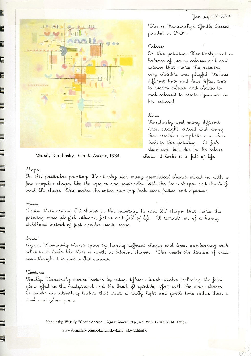
Before we started to create our watercolour sketches or even plan them, we had to do a little bit of research first otherwise we wouldn’t have any knowledge to go by. We had to research different definitions (most of which I already knew about, so it was more like a review for me) and we also had to investigate some of Wassily Kandinsky’s artworks.
When we looked at the different painting that he created from different parts of his life, you can see how he progressed from being a realism painter, into an abstract painter. In the beginning, his images looked, basically, real. But as you look into the painting from his later life, you can see that shift from the realism to the geometric shapes that most people have no idea what they are supposed to be. It’s like painting a red square and a smaller blue square. It could represent an apple and a blueberry, or a textbook and a novel or even a parrot and a bluebird.
When we see the painting, something about the colour choice or layout would become very appealing to me, but I would never really understand what was going on inside the painting itself. In english terms, everyone of these colours or lines or shapes would be a use of symbolism.
Experiment:
After we researched a bit, we started to experiment with colour and abstracting images. In the beginning, I had created a monochromatic colour value scale and also an analogous (semi) colour wheel. This was a review to me, but I was able to experiment with different shades and how these different mediums worked on my sketchbook paper and also how it reacts to different quantities of water.
We also experimented with different techniques of brushstrokes for watercolour. We experimented with the different combinations of dry and wet (dry on wet, wet on wet, wet on dry, dry on dry) and we also practiced a few patterns and textural brushstrokes like stippling and rolling. I also experimented myself, trying to get some very delicate brushstrokes, using really diluted watercolours and also using plain water to blend two colours together. I also tried using a very watery, but bold watercolour mixture to create little delicate dots and it actually turned out to looking pretty good in my opinion. We also experimented with different mediums to paint on. For example sketchbook paper and wood. We were helping with making the tiles for the horse mural in time for the Chinese New Year Festival. I’m in the Art Club so I knew how it worked, but it was still a little bit tricky getting the colour to stay on the wood as the colour kept seeping through the wood. For me, I totally prefer the sketchbook paper.
Finally, we took one of the pictures that we have selected to try and abstract, and printed it in black and white. Then we did one layer of abstraction and used watercolour to paint it in a triad harmony colour scheme. I ended up going for red-violet, yellow-orange and blue-green as the colours really appealed to me. This was our trial for the watercolour abstraction of this unit. It think that it went quite well for me, but there were some mistakes that I made, including the dabbing with the paper towel, so I learnt from my mistakes.
I also did a few watercolour sketches in my free time just so I got used to using the watercolour medium as I hadn’t used it in quite a bit of time.
Selection:
The selection process was quite easy for me in this unit. I needed a photo that was simple enough so I didn’t have to go into quite so much detail, but still complicated enough so there was something for me to abstract. I didn’t like my other photos very well, other than the two flower photos that I ended up using for this unit. It was a quick selection. I knew that flowers had tons of petals so it gives me something to abstract without having to deal with a vast amount of complicated sections.
The selection process of the colours were also quite easy for me as I got the mood of the image right away. I think that when it comes to art, I can be quite stubborn so when I think of something that I really like, I tend to stick to it. This time, it was the colour scheme. I really liked the colour scheme that I used when we were experimenting with the triadic harmonies, so I decided to stick with this overall colour scheme for all of my paintings.
Develop:
How I developed my watercolour sketch was actually in the abstracting stage. It is quite hard to abstract an image in one go, as there are so many details that you think you need when you actually don’t.
While I was developing my painting, I just kept abstracting and abstracting my image more and more. For my “White Flower” image, I developed it into seven abstractions before I decided to stop there. For my other flower image (“Delicate Petals”), I decided to stop at three abstractions, but I still had to keep developing my abstracted image further and further until I was happy with it.
Plan:
For this unit, the planning stage would be to be deciding which part of your image you want to use, what colours you want to use, what types of brush strokes and so on. I originally had only really planned for one watercolour painting. I had abstracted the “White Flower” image to abstract number three, and I had planned to stop there, but I realised that I could abstract it even more, and Ms. Lovett thought the same. So in the end, without it being much planned, I ended up doing seven abstractions of the same image and three watercolour paintings of the same image.
For art, I am more of a go with the flow kind of girl I would say. I like to have the basic structure there, but I like doing things freehand. It makes me feel like I can use my creativity and not getting stuck by a textbook or something like that. So after I had finished the first three watercolours, I was ahead of time. So I decided to abstract another image. Then I just started playing around with different types of brushstrokes, colour combinations, textures and so on until I literally ran out of time. So I ended up with completing eight watercolour paintings.
Create:
For me this stage was really fun. I have always loved watercolour and it is my favourite medium for painting with. I like my art to be really girly and pretty, so watercolour is like the perfect medium for me as it can look quite delicate, if only you know how to use it and how much water to add.
For my first one, I was having a great time painting, and I think that I was quite fast with watercolour, so I had four paintings after the weekend had passed. When I looked at them after they dried , I was a bit shocked at how splotchy they were and there were patches that were darker and some that were lighter.
But as I created more watercolours, I believed that I have improved. Making sure that I was dabbing the watercolour carefully, using the correct brushes, using certain brushstrokes, creating texture and most importantly, adding more water. My first few watercolours were a lot darker than I liked them to be, so when I was creating my other paintings, I learned from my mistakes and added more water, unless, I was using a darker paint on purpose (for example, while I was experimenting with value).
In the end, I think that I got a lot better in controlling my brush and making sure that I was being gentle with the watercolour and also while dabbing the extra colour away on the paper so that it would be lighter.
Evaluate:
For this unit in criteria B, I think I would give myself a 7 out of 10 because I don’t think that I did terrible. But my watercolours in the beginning were definitely not perfect and my other paintings are definitely not perfect either. I am sure there are many flaws in my paintings. But I think that I tried my best at trying to improve my skills, and I believe that I did do that. I believe that I have the basic skills of watercoloring and I believe that I have improved a lot since the beginning. Whereas my paintings used to be a bit splotchy, my last four paintings I would say are a lot smoother and a lot more delicate than my paintings from the beginning of the unit. Like people say, “practice makes perfect.” Therefore, I would give myself a 7.
Response:
To me this was my favourite unit so far in art class. Even when I was young, I would have a box of watercolours to play around with. I have always loved the paintings with the faded edges and I realised that they were painted with watercolour. That pushed my interest in watercolour even more. Especially after finding out about Inslee Haynes. I just love her work. I constantly want to be able to paint like she does. She uses bold colours but she uses them in a way that makes them look delicate. So this unit gave me some practice with that.
Also, I have always been interested in colours. I don’t know what started this interest but I just love experimenting with different colour combinations and things like that so this unit was just perfect for me as we were able to experiment with so many different colours.
Overall, this was just my favourite unit out of all of the other ones. This was the most fun for me as I have always loved watercolour since I was a little kid but I never got the proper lessons on how to use them. So I thought that this unit was very interesting and I really enjoyed it.